


Dear Indie Comics Creator...
Where is the lettering supposed to go?

Hey, how’ve you been?
If you’re like me, you’ve been reading a lot of great comics lately.
The other day, I was talking to my LCS owner (shout out to Alan!), and we were both saying how many great books are being put out now—from the Titan Conan stuff, to the Ghost Machine titles, to some of the great licensed books from Mad Cave and Dynamite—and we are genuinely excited to be excited about comics these days.
And while I was reading one of those fantastic books this week, I got hit with the inspiration for this post.
So read on if you’re interested in making better comics… or if you just wanna find out what the hell book I was reading last night…
Preamble: Does That Mean to Amble Before You Amble?
I’ve been doing a fair bit of lettering the last several years, and every now and then, a writer and/or artist will ask me what they can do to make things easier on the letterer.
And sometimes—like, say, now—I offer my opinion unsolicited. :)
Where to begin?
Like Skottie Young, I think this book is a must-read for anyone who wants to make comics. But I can’t say that because he already did:

I have access to two copies, one at home and one at the office, and I keep both by my computer—and reference them frequently.
Nate Piekos has written the lettering Bible as far as I’m concerned.
(Or the Lettering Bhagavad Gita, if you’re so inclined).
Nate’s site also offers loads of fonts that are free for use for indie creators, plus an excellent how-to section.
So for this ‘stack, I figured I’d pull from both the book and his site for tips on how both writers and artists can make life easier for the letterer.
End of Preamble!
First Things First: Comic Scripts
It’s been pretty well settled that comic writers are the most important part of the team. After all, without their genius, the thing wouldn’t exist!*
(*Editor’s note: Bullshit.)
Unlike, say, screenwriting, there is no set standard for comic script formatting.
But the whole point of your script is to get a ton of information across to the team in as economical a way as possible.
Nate prefers Fred Van Lente’s format for a comic script. I’ll let him tell you why, because a) he does a great job, and b) I’m very lazy.
Now, lucky for us writers, that mensch Fred compiled several downloadable templates based on his formatting.
(I created my own template in Scrivener based on his method before it was cool that was an option here.)
OK! Does everybody know how to format a script now?
Great.
But what else can a writer do to help the letterer?
Take it away, Nate!

Yes, it’s true. Letterers copy and paste from your script.
If it’s riddled with typos, or not formatted exactly how you want it, that is how it will appear on the page.
Because we are not copy editors. Who knows, maybe those typos were on purpose!
Oh, sure, we may fix a few obvious mistakes, because we know we’ll be asked to go in and fix them later. It saves us a step and is courteous, but you’ll save everyone (yourself included!) a lot of trouble if you have the script in its final form when it comes to us.
(Incidentally, we are also not story editors or punch-up artists—two requests I’ve gotten more times than you’d believe!)
But enough yapping about the (*yawn*) writers. This is a visual medium! Artists are WAY more important!*
(*Editor’s note: Actually true.)
So let’s talk art.
It’s Not the Size of the Page, It’s…OK, it’s the Size of the Page
Nate has a handy section on his site about Original Art Dimension. Again, he does a great job explaining it all, but I want to call something out:

Because old school comic art boards were 11 x 17, many artists set up their digital artboard to mimic this.
However, that’s not the size the full bleed artwork should be.
See the green print above?
The full bleed is 10 x 15.375.
When reduced, that comes out to a standard comic page. (6.875 x 10.438.)
Sometimes I’ll receive 11 x 17 artwork that’s either full bleed or there’s a ton of extra white space on the page (making the art smaller than it should be).
It’s not a huge deal for me to format your pages to the proper size… but the letterer isn’t the production department, and if you can save the other people on the team from having to do extra work, they will appreciate you.
Blah Blah Blah. Get to the point
OK! Here it is! The moment you either have or haven’t been waiting for! The book that inspired this post!
The following examples are from SPACE GHOST #4, the latest in the excellent series written by David Pepose, with line art by Jonathan Lau, colors by Andrew Dalhouse, and letters by Taylor Esposito. It’s edited by Joseph Rybandt for Dynamite Entertainment.
This issue jumped out at me not only for being a great read, but because as a letterer, I appreciated the craft that went into it.
The One on the Left Speaks First
In the Comics Experience Writing Course I took a few years back, teachers Paul Allor and Andy Schmidt taught us that when writing panel descriptions, we should describe the action in the order it should appear within the panel, from left to right, as this is how many artists will lay it out.
This is good practice, and I try to do it as much as I can when I write scripts.
But an artist can help themselves by looking at the order of dialogue in the script and putting the character who speaks first on the left.
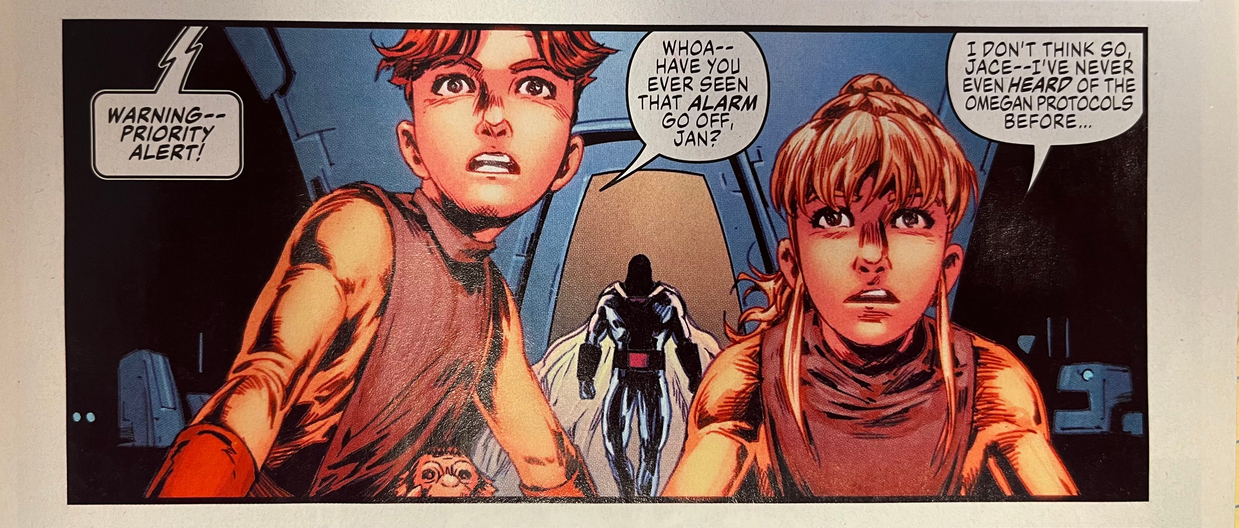
See how smoothly that reads?
The computer voice continues from the previous panel, and Jonathan Lau leaves plenty of room for it on the left. Then Jace speaks, then Jan.
Sometimes, due to the way a scene is staged, it may be impossible to keep characters in this speaking order. When that happens, the key is to plan for it:

See how there’s room for the woman’s dialogue at the top of the page, followed by room for Jan’s underneath?
And there’s still plenty of room for the off-panel dialogue at the top right to pull us towards the next panel.
This space, and flow, is something that can and should be incorporated into your layouts.
Go ahead and make placement suggestions at this stage—the letterer may or may not follow them, but at least you’ll be thinking about where the balloons might go at the earliest possible point.
Check out the three panels below and think about how the artist planned for this at the layout stage:
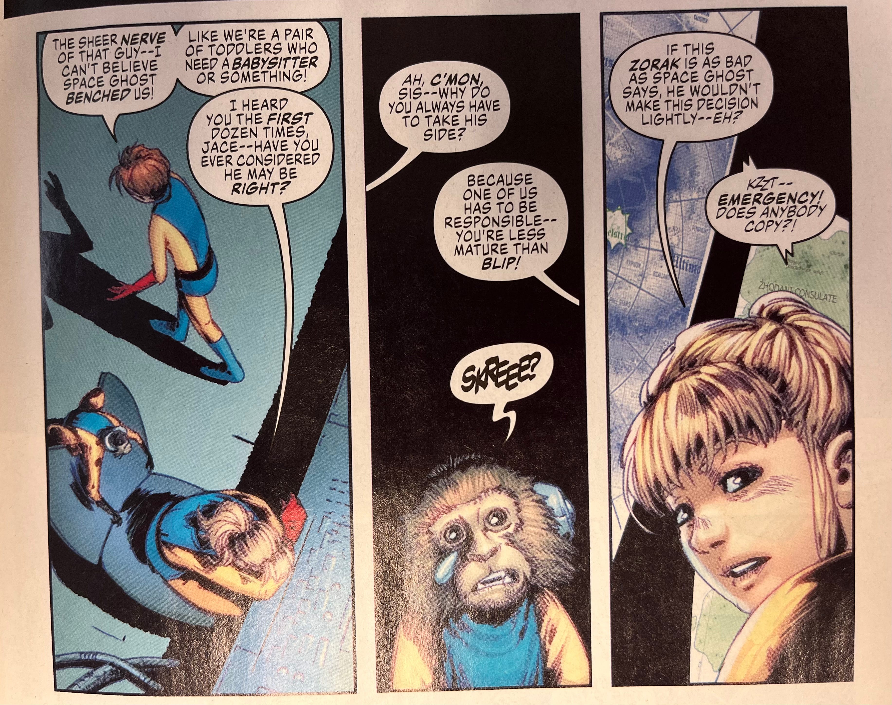
In panel 1, the negative space for dialogue flows like a backwards, upside down L. The figures themselves are constructed around that negative space, the action staged perfectly for the flow of dialogue.
Panel 2 contains three balloons, which is a lot for a relatively tiny panel. But Blip takes up less than a third of the panel—the top two-thirds is negative space! Which gives us plenty of room for the balloons and an expressive monkey.
The final panel contains one less balloon, so Jan gets to be a little bigger in the frame. About half of it to be exact.
Which leaves half of the panel (!) for dialogue.
Does that seem like a lot?
I dunno…the art still seems pretty detailed and clear to me.
Here Endeth The Sermon
It’s easy to want to cram every panel full of detail from top to bottom, and it’s not just something indie artists struggle with.
In the excellent Life is Drawing without an Eraser, comics superstar Mike Grell says that when he’s finished drawing a page, he reduces the contents of each panel by 10% just to make sure he’s left enough room for letters.
If he can do it, so can you!
Speaking of Scripts…
This happened recently:
Production will be starting shortly, with the Kickstarter soon to follow. I know everyone says this, but… I think it may be my best script yet.
Looking forward to seeing what you think.
Is it Too Early for RED XMAS Decorations?
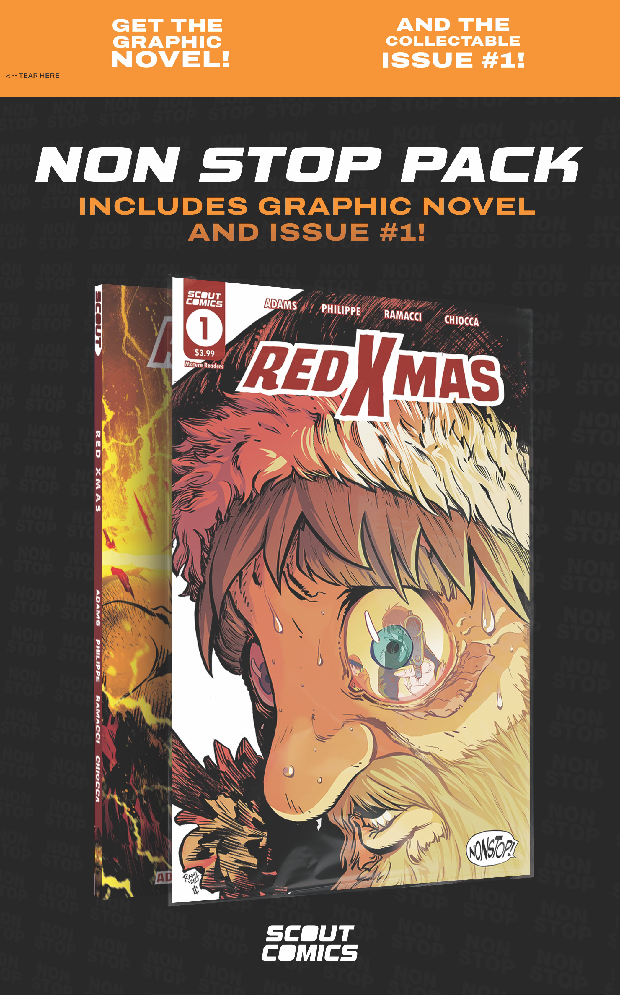
Scout Comics is offering a collector’s pack of RED XMAS #1 and the full TPB, available November 6, 2024 at only the finest local comic shops.
(My buddy Alan will have it. Right, Alan?)
(RIGHT, ALAN?)
You can reserve your copy by telling your version of Alan to pre-order a copy.
Full solicits are below:
(W) Clay Adams, Alexandre O. Philippe (A/CA) Fabio Ramacci (C) Ilaria Chiocca
A NONSTOP collector's pack! This beautifully designed hangable package (measures 8 1/2" x 12 3/4") includes a collectible first issue (bagged and boarded) and the complete trade paperback! Just in time for the holiday season! When Mrs. Claus dies in a tragic toy accident, Santa vows to make all those little brats pay! But when his rampage kicks off at the home of FBI agent Ellie Tewksberry, he's messed with the wrong lady. Mama Bear will travel to the ends of the earth to save her son-even if it means teaming up with the Easter Bunny, the American Santa Society (A.S.S.), and her wannabe-elf ex-husband.
In Shops: Nov 06, 2024
SRP: $24.99
Final order cutoff is 9/30/2024, so get on it, Frequent Frier!
The Show-Me State is Showing… Me

That young fella in the picture will be looking a lot grayer at the Missouri Anime Festival in a couple of weeks.
I’ll mostly be signing anime related stuff, but I’ll have a box of comics with me if you’d like to order from the secret menu.
If you’re local to the show, come on by!
Finally…
I hate to end on a downer, but it’s been a bad week for comics, as we lost both John Cassaday and now Karl Moline way too early.
I didn’t know either gentlemen personally, but by all accounts they were great guys…and, oh man, the talent!
Words don’t seem sufficient at a time like this, so I’ll just say…
Rest in peace, fellas. You will be missed.
(And I bet you both left plenty of room for the letters.)
-Clay
Great write up! I have had that book in my Amazon cart forever! I think you just convinced me to pull the trigger on it. An old professor of mine, Mark Kneece, wrote The Art of Comic Book Writing. Definitely worth checking out as well.
Going to bookmark this post for future reference.
Comic writing feels a bit like traffic control. Between giving the artist enough information to fully realize the setting and the action, to making sure to leave enough room for the dialog and sound effects. Then trying to manage pacing, and I like to use odd number pages to either scene break or build tension. It's a lot to manage while also trying to tell a compelling story.